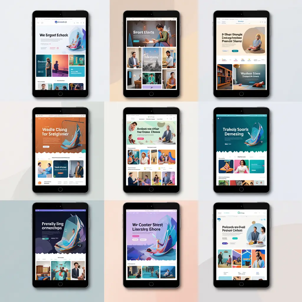
How Web Design Affects Your Traffic
You know, in this ever-evolving digital age we’re living in, it’s hard to overstate just how crucial web design really is. So, what exactly is web design? Well, it’s all about planning and creating websites, but it’s way more than just slapping some pretty pictures on a page. It involves a bunch of different elements—like layout, content, graphics, and user experience. It’s this careful mix of how things look and how they work that keeps users engaged. Really, web design acts as a vital link between businesses and their audience, shaping not just how info is displayed but also how people actually interact with it online.
Think about it: effective web design is like the front door to the digital world. It’s super important for attracting and keeping visitors. In a world where your online presence can literally make or break a business, having a well-designed website is essential. A solid web design doesn’t just look professional and trustworthy. Nope! It also creates a smooth user experience that invites people to explore and interact with the content. So, it becomes this key tool for boosting website traffic and turning those visitors into loyal customers.
Now, what’s the point of this article? Well, we’re gonna dive into the complex relationship between good web design and the increase in website traffic. We’ll look at some essential design principles, user experience strategies, and how responsive design plays a role in all this. By the end, we hope to shine a light on how a well-thought-out website can seriously impact how visitors behave. Plus, we’ll point out just how crucial web design is for growth and success in today’s competitive online scene. Sounds good, right?
First Impression Matter
First impressions matter significantly, especially in the digital world where attention spans are often fleeting. The initial interaction a visitor has with a website serves as a powerful psychological trigger that shapes their perception of the brand. Research shows that users form opinions about a website within a mere fraction of a second. This underscores the necessity of thoughtful design—it’s not just about how a website looks, but how it makes the user feel. A well-crafted website can evoke trust, credibility, and interest, leading users to engage more deeply with the content, while a poorly designed site can deter them in an instant.
Aesthetics play a pivotal role in web design, serving as the gateway to user experience. Color schemes, typography, imagery, and spacing all contribute to the overall tone and mood of a website. When these elements are harmoniously integrated, they create an inviting atmosphere that encourages exploration. On the other hand, a chaotic or unattractive design can lead to confusion and frustration, causing users to leave before they even fully explore what the site has to offer. The psychological impact of aesthetics extends beyond mere visuals; it affects cognition and emotion, influencing the likelihood of engagement and conversion.
Moreover, a clean and professional appearance is paramount in establishing authority and trustworthiness. Users are often wary of websites that appear cluttered or unprofessional, associating these traits with a lack of credibility. A sleek design that prioritizes clarity and usability communicates to visitors that they are in a safe space where their needs are prioritized. By investing in a polished and cohesive design, businesses can not only enhance their brand image but also increase user retention and satisfaction. In today’s competitive online landscape, where first impressions can make or break a brand, ensuring that every visual aspect contributes positively to the user experience is essential for success.
User Experience (UX) and Navigation
So, let’s talk about User Experience, or UX, in web design. Basically, it’s all about how a person feels when they’re using a website or an app. There are a bunch of things that play into this, like how easy it is to use, how accessible it is, and how nice it looks. When designers really get what users need and want, they can create something that makes navigating the site a breeze. This means understanding how people behave online, what they like, and what tasks they want to tackle. The goal? To create a space that’s not just pretty but works well, making it easier for users to achieve what they’re after. Good UX doesn’t just make people happy; it also helps build trust and loyalty.
Now, let’s dig into navigation—it’s super important for keeping users around. If folks can find what they need quickly and without any hassle, they’re way more likely to stick around. Clear navigation is like a roadmap; it shows users where to go and helps them interact with the content without feeling lost. But if navigation is all jumbled up or confusing? Well, that can drive people away fast. A website that nails intuitive navigation is much more likely to see people coming back for more.
And here’s something to think about: there’s a real link between a smooth user experience and lower bounce rates. When the UX is designed well, and navigation is user-friendly, it keeps people interested and encourages them to look around instead of just bouncing after one glance. If users can find what they’re after in no time, they’re less likely to leave right after landing on the site. On the flip side, a confusing or frustrating experience can send users packing pretty quickly. So, putting in the effort to create an easy, seamless experience doesn’t just keep users on the site longer; it really boosts overall performance and, in the end, helps the website thrive.
Mobile Responsiveness: Adapting to a Mobile-First World
You know, the way we use the internet has really changed, especially with all the mobile traffic out there. It’s reshaped web design in a big way. I mean, did you realize that over half of all global web traffic comes from mobile devices? That’s huge! So, businesses nowadays really can’t afford to overlook how their websites perform on mobile. This whole shift has some serious consequences for the structure, design, and optimization of websites. As more people are scrolling through content on their phones and tablets, it’s essential that websites make navigation, load times, and overall functionality work smoothly on these devices. Otherwise, they risk losing users—no one likes a frustrating experience, right?
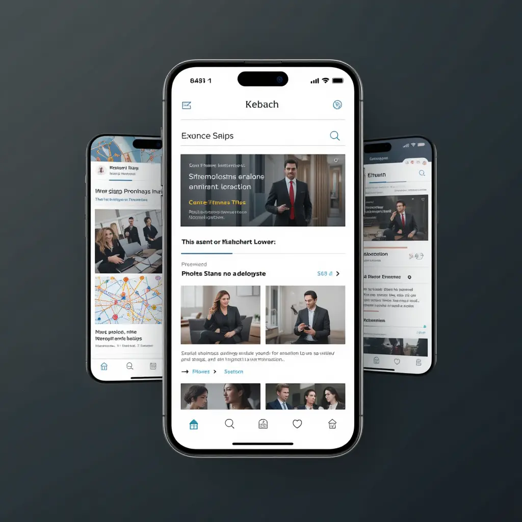
Let’s talk about some key principles that make a website mobile-responsive. First off, there’s fluid grids, flexible images, and those handy media queries. Together, they create a pretty seamless experience no matter what screen size you’re on. A fluid grid system? It’s like magic—it scales layout elements proportionally, so the content just flows, whether you’re on a tiny smartphone or a big desktop monitor. And those flexible images? They keep their aspect ratio while resizing, which means no weird distortion and everything looks just right. Media queries? Oh, they’re super important too. They help apply different styles based on the device’s features, like screen width and orientation. Sticking to these principles really helps designers make websites that perform well for everyone, no matter what device they’re using.
Now, let’s look at a few real-world examples that show how mobile design can seriously impact website traffic and user engagement. Take ASOS, for instance. They revamped their mobile site to make shopping way easier—and guess what? They saw a whopping 50% jump in mobile transactions in just six months. Then there’s CNN; after they redesigned their website for mobile, they got a nice boost in mobile traffic too, with a 25% increase in page views from mobile users. Pretty impressive, right? These cases not only underline why mobile responsiveness is a must, but they also show how it can really amp up user engagement, drive those conversions, and ultimately help a brand thrive in this mobile-driven digital world.
Loading Speed and Performance
You know, in our super-fast digital world today, how quickly a website loads is absolutely crucial. If a site doesn’t load in a snap, users can get pretty frustrated. I mean, studies show that most folks expect a site to pop up within two seconds. If it drags on longer than that, well, many people just bounce right out of there. That’s not good for keeping users engaged or happy. Plus, search engines like Google are all about speed too. They tend to favor websites that load quickly, so if yours is slow, it could get buried in search results, making it tough to pull in that organic traffic.
So, how can web designers and developers amp up that loading speed? There are quite a few tricks they can try. One solid approach is optimizing images—like compressing them without losing quality—so they load faster. Also, ever heard of lazy loading? It’s actually pretty handy; it means images and videos only load when they’re about to appear on the user’s screen. And, let’s not forget about cutting down on those HTTP requests by cleaning up the code and using content delivery networks (CDNs). That can really help speed things up. Oh, and caching strategies—both on the server side and for users—can make a big difference too. They let people access frequently used data way quicker.
The link between how fast a site loads, the amount of traffic it gets, and conversion rates is pretty eye-opening. Research says that just a one-second delay can cause a 7% drop in conversions. Crazy, right? And there’s that report from Google indicating that over half of mobile users—53%, to be exact—will ditch a site if it takes more than three seconds to load. These numbers really underline how vital it is to optimize your page speed—not just for SEO but also for boosting traffic and conversion rates. In a world where every second counts, businesses really need to put web performance at the top of their list to keep users happy and drive success online.
SEO-Friendly Design: Blending Looks and Function
So, let’s talk about something super important in today’s online world: the mix of SEO, or Search Engine Optimization, with web design. Honestly, it’s becoming really essential. When we say SEO-friendly design, we’re looking at websites that not only look great but also do a solid job of climbing the ranks in search engine results. It’s all about understanding how different design features—like layout, color choices, and font styles—can shape how users interact with a site. A site that’s designed well? It can really keep people engaged, making them stick around longer and bounce away less. And guess what? Search engines take notice of those things when they decide where to place your site in search results.
Now, let’s dig into some on-page elements. You’ve got headers, images, and meta tags, right? These are crucial for boosting SEO while keeping the user experience smooth and intuitive. Headers, like H1 and H2, help break down content in a way that’s easy to read. They tell both users and search engines what’s important. And those images? If you optimize them with the right alt tags and filenames, they don’t just look good—they help people find your site more easily. Don’t forget about meta tags, especially title tags and meta descriptions, since they’re like quick previews that can really boost your click-through rates. So, getting these elements right can seriously up your SEO game.
But wait, there’s more! Good design isn’t just about how things look; it can seriously influence your search engine rankings too. Take responsive design, for example. It makes sure your site works well on any device, which is a biggie for search engines like Google—they really care about mobile-friendliness. Plus, if your pages load quickly, that’s a win for user experience and rankings too; search engines consider page speed as a ranking factor. So, by honing in on usability, accessibility, and how everything functions within your design, web designers have a real chance to boost a site’s SEO potential. In the long run, that means more organic traffic and, ultimately, steady growth for businesses trying to thrive in the digital space.

Compelling Content and Visuals
These days, in our crazy digital world, having eye-catching content and visuals is super important if you want to grab and hold onto people’s attention. You s uniee, design plays a huge role in making content easier to read and engage with. A good layout? It’s like a roadmap that helps guide readers through all the info and highlights the essential bits. When you focus on clear fonts, enough white space, and smart alignment, it breaks down complex ideas into bite-sized pieces that folks can easily digest. Plus, when you throw in some smart design tricks—like using contrasting colors and a solid visual hierarchy—everything becomes not just easier to read but also more attractive, pulling users in to explore more.
Now, let’s talk about the balance between text and visuals—it’s key if you want to make a real impact. Text gives depth and context, sure, but visuals like infographics, photos, and videos? They help simplify tough concepts and stir up emotions. This combination of text and visuals creates a kind of immersive experience that keeps audiences engaged and helps them remember the information better. Finding that sweet spot means getting the story that each piece of content wants to tell and using visuals as more than just pretty pictures. They’re crucial elements that actually boost the overall message.
And hey, let’s not forget about the power of high-quality images and videos in web design! Seriously, the right visuals can completely shift how users perceive a brand, making it feel more professional and trustworthy. When you choose images and videos that are not only high-res but also thoughtfully crafted, they don’t just grab attention—they enhance the content, making it relatable and memorable. In a time when we’re all drowning in information, using top-notch media alongside engaging content really helps a brand stand out. It creates a richer experience that builds loyalty and makes people want to share. In the end, mixing strong design elements with good content makes everything more effective, resulting in a seamless blend that captivates and informs.
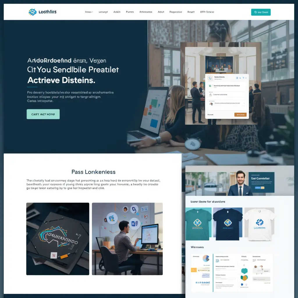
Branding and Consistency
When we talk about web design, brand identity is super important for creating a strong and memorable online presence. A solid brand identity really captures what a business is all about—its core values, mission, and personality. You can see this through various design elements like logos, color palettes, typography, and images. All these components work together to send a clear message to users, helping build recognition and trust. So, when someone lands on a site that clearly reflects a well-defined brand identity, they’re way more likely to engage, share, and actually convert. In the end, this boosts the business’s reputation in what can be a pretty crowded digital world.
Now, let’s talk about consistency. It’s crucial for branding across different web pages and devices. When users are exploring various sections of a site or hopping between their phone, tablet, or computer, they should see familiar design elements that reinforce the brand’s identity. This kind of consistency not only helps users navigate but also makes the site look better overall. For instance, keeping typography the same, using a consistent color scheme, and having recognizable icons can help the brand look coherent, no matter where the user is interacting with it. Doing this builds a reliable experience that boosts user satisfaction and loyalty.
Take Apple, for example. Their website is a fantastic case of successful branding through web design. The minimalist design of Apple’s site really reflects its product philosophy—simplicity and elegance. They use a lot of white space, sleek typography, and a color scheme that just works, making their brand instantly recognizable. Plus, whether you’re on a desktop, tablet, or smartphone, Apple’s branding stays the same. You get the same look and feel, which is what users expect. This smart approach not only strengthens brand loyalty but also creates a welcoming environment that encourages users to explore and connect with the whole Apple ecosystem.
Calls to Action (CTAs) and Conversion Rates
Okay, so let’s talk about Calls to Action, or CTAs, and why they’re super important for a website. You know, they’re those little nudges that guide people to do things like buy something, sign up for a newsletter, or just ask for more info. The way you place these CTAs on a webpage really matters if you want to get more people to take action. A well-placed CTA can totally change the game, making users more likely to engage. For example, if you put a CTA right at the top of the page, people will see it without having to scroll down. And, hey, using bright colors or larger text? That can really grab attention!
When CTAs fit smoothly into the overall user experience, they do more than just look good—they also build trust and inspire people to take that next step.
Now, if you really want your CTAs to shine, you need to think about a few design tricks. High-contrast colors that pop against the background are key, and keeping the language short and snappy is a must. You want action verbs that make people feel like they can’t miss out. Plus, using recognizable shapes and some smart spacing can help guide the user’s eye right to those buttons or links. Adding in some arrows or icons? That’s another nice touch to help folks know where to click. It’s all about making the design both pretty and functional so that it really encourages users to take action.
And here’s a fun fact: stats show just how crucial these design choices are when it comes to conversions. Some studies have found that changing the color of a CTA button could boost conversions by up to 200%. Crazy, right? And tweaking the text can sometimes increase click-through rates by as much as 300%! Plus, if you do A/B testing with different designs, positions, and wording, you might discover some surprising results.
Optimizing conversion rates isn’t a one-time thing; it’s a continual effort. Even small tweaks can lead to big changes in how engaged users are and can drive sales up. So, by really focusing on how you design your CTAs, businesses can turn casual visitors into loyal customers. It’s clear that design plays a huge role in making conversion strategies work!
So, to wrap it all up, let’s talk about web design. It really is super important when it comes to pulling in and keeping visitors on your site. A site that looks good? Yeah, it grabs attention, but it also makes it easy for folks to navigate and find what they’re looking for. In this digital age we live in, first impressions matter a lot. Seriously, a user’s initial experience can totally change how they act on your site, which in turn can affect how well you convert visitors and succeed overall. So, when you think about it, putting money into solid web design isn’t just a quick fix—it’s more like planting seeds for the future. It can really pay off by building trust and making users feel engaged.
And hey, it’s crucial for both businesses and individuals to remember that the online world is always changing. Because of that, it’s super important to keep checking in on how your web design is doing and make improvements as needed. Think of this as a little nudge to all of you to take a step back and look at your own site. Are there things you could tweak or improve? Even if it’s just some small changes or a full redesign by a pro, every little bit helps. All these efforts toward a better user experience can really lead to more traffic and lasting success in this competitive online scene.
Launch your own branded Chrome extension in just 15 minutes with zero coding required to instantly elevate your professional authority. Use our proven templates to streamline your operations or deliver white-labeled solutions to clients for effortless recurring revenue.
https://www.youtube.com/watch?v=ATYTVlN5MSM
Have you ever dreamed of breaking into the book market, only to be crushed by the reality of how hard it actually is? The “old way” of creating children’s books is a total grind: you need to write a compelling story, find professional illustrators, and master complex design tools. For most people, creating just one personalized book takes days or even weeks, making it impossible to build a real, scalable business. This massive barrier to entry has kept you stuck on the sidelines while a few “insiders” dominate one of the hottest niches in the world.
https://bookmarket.expert/StoryHero
StoryHero shatters that barrier by using advanced AI to generate fully illustrated, personalized kids’ books in just 5 minutes. You no longer need writing skills, design experience, or a massive budget to tap into a market where parents gladly pay $20, $30, or even $50 for a single book. For a one-time investment of just $17, you get the exact tools and the $6 million case study that will allow you to stop accepting mediocrity and finally start building the life of your dreams.
https://bookmarket.expert/StoryHero
You’re receiving this email
because we believe
our offer
may interest you.
If you do not wish to receive
any more messages from us,
you can
opt out:
https://bookmarket.expert/unsub?domain=dxbly.com
Address: Address: 5516 Schuepisstrasse 146, NA 6493
Looking out for you, Katherin Grose.